GIS Portfolio
GIS Portfolio
We are finally here. The last assignment.
I created my Portfolio in Google Sites.
I kept my about me short and sweet (like me!) and included the link to my career and education highlights in ArcStory Map that I created and updated for Cartography and Applications in GIS.
I updated my resume to include feedback from a previous submission and I added the groups I am a member of.
On my contact page I included a link to email me directly, my LinkedIn link, and a basic contact form created through Google Forms.
On the Portfolio Page I kept it simple.
I broke the sections up by different skill sets - Emergency Management, Cartographic Design, GIS Skills, and Python/Model Builder.
Instead of writing about each thing I included- I linked them all back to my blog posts that I think covers skills and tools used well.
For Emergency Management I included skills I think benefit that particular sector.
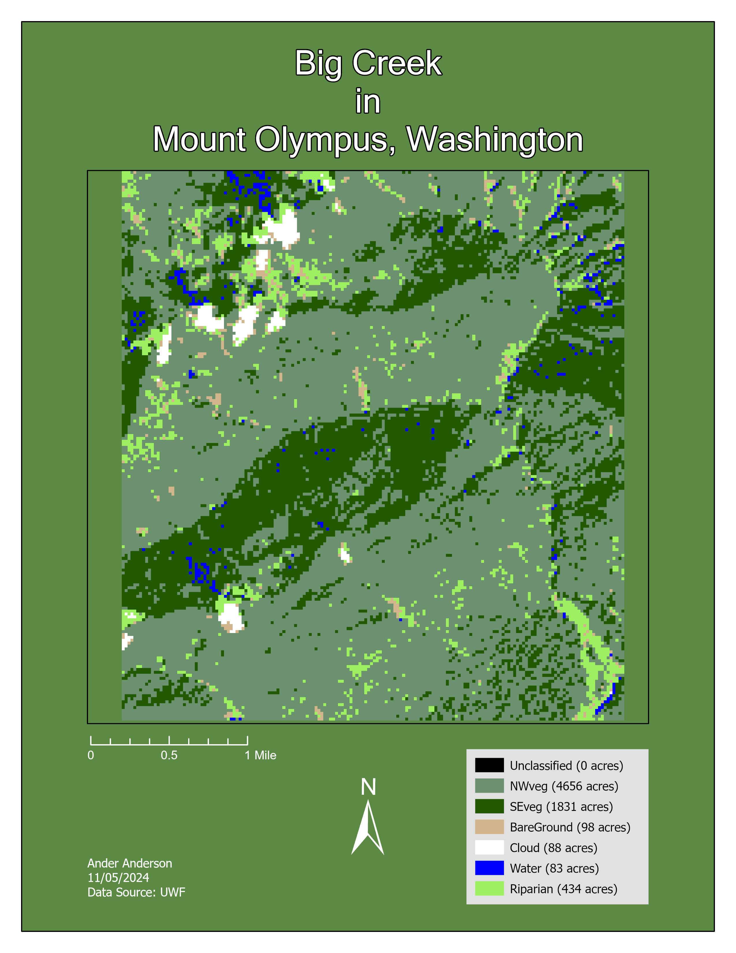
For Cartographic Design I picked my three favorite design focused maps.
For GIS Skills I went with the skills I am comfortable with and had nice looking maps.
For Python and Model Builder I linked the associating module where the code, model, and flowchart came from.
I included my Student Spotlight that links to the spotlight and the project associated with it and I added a section that links to my blog and the different classes.
This last semester ended up being the "toughest" because of different work and personal situations.
But I am proud to say I made it and I am excited for what my future holds.
See you lucky ducks around!
Don't hesitate to reach out!