Posts

Showing posts with the label GIS 4006 - Cartography

M7 - Google Earth

Google Earth

Module 7 is the last Module in our Cartography Course. 
The last lab objectives were to create a Google Earth Map Tour of South Florida utilizing kmz files from ArcPro. 

The layers to Google Earth (kml/kmz) was a reinforcement of skills I learned back in Intro to GIS so I did not struggle there. 

The tour turned out to be a bit more tedious than I thought. Creating the landmarks of things I found interesting (Buildings, Landmarks, Ships, Planes, etc) was straight forward - but creating the tour itself in under 5 minutes without making viewers dizzy was a challenge.

I also had to re-record a few times because my city labels would not show. 

My tour starts with quick aerial view of the Miami Metro Area - West Palm Beach to Homestead. 
We fly into downtown Miami and get a quick glimpse at our first Bank of America Building. From there we fly through the skyscrapers to a multi use building that is playing a game of Connect 4. We then sail on over to the Cruise Terminal to check out the Royal Caribbean Freedom of the Seas, Carnival Victory, and Norwegian Pearl. We then navigate down the port to check out the container yard that has a small section of containers in 3D. We see a cargo crane ship and a container ship with Downtown Miami in the background. We then fly back towards Downtown Miami to check out a cool condo complex and then pan over to the The Challenger Memorial across the street. We then zip across Miami Metro to the Miami Airport to the one 3D plane I could find in our required cities with Air Traffic Control in the background. 

From there we take off to Fort Lauderdale. Not a lot going on 3D wise like our lab instructions advised but we did a quick circle around the city. The Bank of America Building is in the center with a pyramid top.

Next we land in Tampa - a quick shot of downtown Tampa and the we pan over to University of Tampa with their cool domes. We quickly land in front of the the local NBC news center to gaze at the Tampa Skyline with the iconic Sykes building and yes! - That's another Bank of America Building! The other skyscrapers you see are a mix of banks, hotels, apartments and other various businesses. We hop into downtown at the Tampa Police building and then jump over to a mural of the City of Tampa. We then slide through the streets of Tampa showing how some buildings have more detail than others. 
From there we throw a pass to the Raymond James Stadium- home of the Tampa Bay Buccaneers. We swing around to the Legends Field (now George M. Steinbrenner Field) where the New York Yankees do their Spring Training. We head over to Tampa Bay International Airport Air Traffic Control Tower and then we depart for St. Petersburg. 

We land at the Albert Whitted Airport and head over to the University of South Florida. We make a quick stop at the Florida Center for Teachers and then fly over downtown St. Petersburg to our last Bank of America Building! From there we check out (the now) John Hopkins All Children's Hospital Research and Education building and its cool skybridge. We do another quick fly over the St. Petersburg area where you can see the Tropicana Field that the Tampa Bay Rays baseball team plays at. We fly back out to see all of South Florida which concludes the tour at exactly 5 minutes and 4 Bank of America Skyscrapers. 

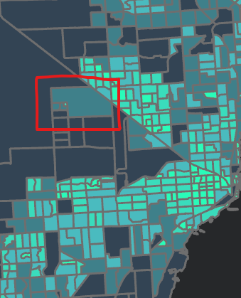
South Florida Population Density


I know you have been wondering who exactly I'm referring to when I say "we" - classmates? the voices in my head? the mouse in my pocket? All viable and partially correct (maybe not the mouse) but all my coursework has been and, will be continued to be, supervised by my sidekick, Mr. Wayne (with support from Lofi Girl hip hop radio beats to relax/study to). 

Mr. Wayne is my sassy 11 year old who has been through almost all my post secondary studies with me. Sometimes he walks across the keyboard and causes chaos but its never anything that can't be fixed. 


And with that - we conclude GIS 4006 - Cartography. I have learned so much and I can't wait to finish reading and applying the rest of the Cartography textbook in time. 

I hope I've been a joy to have in class and I promise to stay cool!

Jumanji!


P.S. As for the future - 
I am hoping my Python CEP certification will help me in my upcoming GIS Programming Course. 


M6: Isarithmic Mapping

Confounded by all the rain and it's only my first day in town.

Isarithmic Mapping


Module 6 had us in the state of Washington, which is per Bella Swan "...under a near constant cover of clouds and rain."

Our objectives were to map Washington State's Annual Precipitation in inches using continuous tone symbology and hypsometric tinting with contours to illustrate the elevation. 

The lab was very straightforward and I was pretty excited to learn about the hillshading. Especially from John Nelson - becoming a huge fan of his work. 

Since most of what I know about Washington State's weather comes from Grey's Anatomy and the Twilight Saga - I went with a rounded map frame and captions (can't hear anything without captions these days) for a screen like feel and a light rain gray for a main background.

Washington State's Annual Rainfall


I used ArcPro 3.2.2. The geoprocessing tools I used were Contour List and Int.


The longest commitment of my life is with Grey's Anatomy. While some people scoff at the idea of a TV show being important to one's life- this show has grown with me. It helped me fall in love with medicine and emergency services.  I have friends, that with the natural course of life, have taken different paths, but we can still relate to each other through the TV show we still love. It's had, and sparked, important conversations about life, death, healthcare, and societies most complex problems. Yes it has its cheesy moments, yes sometimes the drama is a bit much, and yes sometimes very unrealistic things occur- but TV is meant to be enjoyed, to provide a small escape from the actual realities of life.


Quote Reference
Dr. Mark Sloan - Season 2 Episode 18

M5: Choropleth Mapping

Choropleth Mapping


Module 5 was all about Disney's Epcot Drink around the World Real Life Europe Edition  Choropleth Mapping and Graduated or Proportional Symbols.

The objectives were to create a choropleth map based on Europe's population density and graduated or proportional symbols based on Europe's wine consumption. 

I excluded data for Countries under 2500 sq km. I did include the Vatican City in the inset map for wine consumption but excluded from the main legend since their wine consumption was the most by almost 30%

For Europe's Population Density I used Graduated Natural Breaks of Continuous Sage (Green) from low (light) to high (dark).

For Europe's Wine Consumption I used graduated symbols I created myself. I did explore the option of doing both graduated and proportional but graduated worked better with my overall goals for my map. 

I placed the labels and bottles in a way you would know which text went with which bottle and which bottle went with what Country. I did experiment with adding lines for clarification but it made the map feel cluttered. 

I originally had the inset map in the bottom right corner but even with a border it was blending in too much with Turkey. It's not a large inset map but I believe its large enough to convey the data. Again I experimented with lines but it was overwhelming so I tried out the idea from the student example maps.

I listed the data for the Vatican City since I included it in the inset map under the Legend. Its kinda hard to see on certain screens but I could not make it any bigger or bolder without going over the country border.  

I topped off the layers with a Watercolor Paper Texture Raster Tile to give it a wine bottle label feel.

European Wine Indulgence


I used ArcPro 3.2.2. The geoprocessing tools I used were Annotate, Clip, Select and Point to Feature.


While doing this Lab I remembered a documentary I watched years ago. In the documentary, it was revealed that "The most Powerful Person in Wine" was the buyer for Costco, Annette Alvarez-Peters. That little fun fact has stuck with me all these years and according to my recent google search she held that title from approximately 2012 to her retirement in 2020 after 25 years with Costco. Bravissimo!

M4: Data Classification

Data Classification

Module 4 was about data classification. 

Our objectives in the lab were to classify census data of Senior Citizens in Miami-Dade County into 4 of the data classifications- Equal Interval, Quantile, Standard Deviation and Natural Break. As someone who has always battled with math- I could struggle to explain these classifications on a higher/scholarly level, but, since most of my current job and most of my future role will be explaining things that anyone can understand, I did my best to explain it that way.

Equal Interval

The Equal Interval classification is determined by the range divided by the number of classes selected. It can cause an unequal distribution due to classes having no values, classes with lots of values, and/or classes with only a few values. 

For example - if you had a regular box of Legos (range) and wanted to organize (division) them by color (classes)- You would not have as many pinks as you do the primary colors.


Quantile

The Quantile classification divides the total number equally into the selected class.

For example - you have 100 Legos (total number) and 4 people (class). Each person would get 25 Legos.


Standard Deviation

The Standard Deviation classification is also sometimes known as a bell curve. It is determined by adding and/or subtracting the standard deviation from the mean of the data.

For Example: If you want to organize your Legos by length- if most of your Legos are around the same length it would be a small standard deviation(flat..ish curve), if there is a large difference between lengths it would be a big standard deviation(normal curve) .


Natural Break

The Natural Break classification is determined by natural characteristics in the data – like type, shape, color, numbers, etc. 

For example: If you wanted to organize your Legos by type of Legos (natural break) - you could group them by (type) bricks, plates, slopes, tiles, panels.   


For this lab I wanted try out a different style so I inverted my usual style. Dark vs Light. Dark Page, White Text, Dark colors for Low numbers and Light colors for High numbers. 

Senior Population of Miami-Dade County


In this module we also experimented with normalizing our data by Square Miles. Which is better for representing the overall distribution of the Senior Citizens in Miami-Dade County. 

With Normalization
Without Normalization

For example - without the normalization there is an
area (Census Tract 90.40) that is the brightest on all
my maps. 


With normalization - this same area does have a
concentration of seniors but it does not have the
highest concentration.


Senior Population of Miami-Dade County by Square Miles


M3: Cartographic Design

Cartographic Design

Module 3 had us exploring Cartographic Design through Gestalt's Principles.

The labs objective was to create a map of the schools in Ward 7 of Washington D.C that included boundary, transportation and environment layers, and 7 of the neighborhoods in the Ward using Gestalt's Principles. 

Washington D.C. Ward 7 Schools


Keeping the thematic of "Schools" in mind I choose a font for the Title and Subtitles that was fun but not Comic Sans and I used Lego studs of different sizes and three primary colors to label the schools. 

I had multiple reasons for choosing the three colors:

  • Yellow for the Elementary schools 
    • Largest group needed to be bright but not overwhelming
    • School buses are yellow
    • For the American Flag - most hardware on the poles are Gold
  • Red for Middle schools
    • American Flag has red stripes
  • Blue for high schools. 
    • American Flag has a blue union
  • Not Green, Orange, or Purple
    • Green already in use for Parks
    • Orange and Purple were not standing out enough

I took a page from John Innes – I changed the view of the map from absolute north to north east. I centered the middle of the river on the page. I used a dark outline on the Ward for weight and so it would stand out.  

I placed the 3 other “heavy” elements on the left side of the map. To avoid top-heaviness the simple Legend was placed at the top and the school table was centered just below it to give it a drop down feel. The inset map was placed at the bottom left corner opposite of the major cluster of schools in the top right for balance. 

In the Inset Map I rotated the map back to north and highlighted the Ward 7 in a light purple and then made the indicator a dashed purple. For location orientation I place a small north arrow in the inset map and put a White House icon where the White House and a majority of other National attractions are. I labeled where Virginia and Maryland are and then placed another label for Maryland in the right border of the main map for extra location clarification. I left the major roads in gray on the inset map because without them Washington DC was feeling like a rural area- which it is not by any stretch of the imagination. 

I used ArcPro 3.2.2. The geoprocessing tools I used were Clip, Dissolve, Select and Spatial Join for the roads, and Create Feature Class for the White House.


I know you're shocked it wasn't The West Wing cause of D.C. 
And because the theme of the map is School here's a gif of Barbra Howard from the TV Show Abbot Elementary who I believe is an accurate representation of all the influential educators I've had in my life. I would not be where I am without their continued love and support. My Kindergarten Teacher is always my biggest fan on social media but quite a few of my other primary, secondary, and post-secondary teachers are usually right there with her. I do my best to make them proud and show them their efforts were not wasted. 


Module 2: Typography

 Typography


For this Module we studied Typography, Essential Map Elements, and Labeling. 

Due to personal time constraints and a persistent network issue I had to stick to the bare bones of the assignment. 

Customizations
  • Fonts
    • For the City Labels Font and Legend, I downloaded and used Merriweather Sans. 
    • For the Rivers and Swamp/Marsh Labels, I used Bondi MT italicized to represent flow. 
    • For the Title, I downloaded and utilized a font that was mentioned in our supplemental lecture material - IM FELL.
  • Used a yellow star to mark the Capital, Tallahassee, of Florida
  • Used the unique values symbology to show the different water features. (Lakes, Streams, Swamps or Marshes.)
  • I moved or rearranged every required river. 
    • Apalachicola was unique situation - with two differently named rivers on either side - there wasn't a lot of room to make a choice that was mostly visible with no overlap. 
    • Peace, St. Johns, and Withlacoochee River - only slight changes were made to improve readability. 
  • I went with a bolder color on the rivers and swamp/marsh labels for visibility. 

I encountered a small issue at the beginning of the lab - my points were double labeled - a quick search helped me deselect the feature class that was causing the issue. 

I did add a bit of color at the end with a base map since the layout was feeling a bit too stark even with the small bits of color added in. (I realize now that adding that color made some of my cities a bit hard to read, but alas - a lesson learned.)

State of Florida


During this module I couldn't help but think of one of my favorite video series from Digital Creator Elle Cordova. The series is called Fonts hanging out and anyone who heavily uses fonts/typography in their work will enjoy. 


Module 1: Map Critique

 Map Critique

Our First Cartography Lesson was on Map Design were we briefly went over Cartographic History, the Six Map Commandments and the Twenty Tufteisms. 

After viewing all the maps included in the Repository drive and evaluating them - I decided to use Maps from elsewhere to complete the Lab. 

Well-Designed 

For my well-designed map example I picked a map that was posted a month ago in the GIS Reddit. 

Well-Designed Map

This map appeals to my aesthetic -specifically the left side of the map. Which is ultimately why I picked it for my well-designed map. Ever since I saw the post a month ago – It’s something I’ve mentally referred to as a “goal”. I like ideas that slightly go against expected practice. While I’m sure it’s not the first to do so – it’s the first I’ve seen that overlaps a border. I also like the overall color choice and how most of the labels are easy to read. I believe it follows Commandments 1 and 2. The author also practiced Commandment 6 by posting it online for feedback. 
The Center and Right side of the map could be improved upon with labels, explanations, and fixing the border. (I personally think only one map overlapping makes a stronger statement than having all the maps break the border.)
While this map doesn’t meet all the commandments and is missing some basic elements like a legend and scale bar – I believe with the feedback the author was provided – this map will be beautiful and easier to read/understand. 

Poorly-Designed

For my poorly-designed map I asked AI to draw a GIS Map of Florida with County Boundaries. 

Poorly-Designed Map

As I was searching around the internet for more examples of bad maps – I saw where someone asked AI to draw a map and well – it was bad. So, I decided to do the same thing. I asked AI to draw a GIS map of Florida with County Boundaries.  While the overall output is visually appealing– the county boundaries are wrong, the “legend” is cut off, there are no discernable labels, no scale, random maps/pieces of land included with no context, and no title. Every area could be improved upon with a human doing the work. 

As AI becomes more prevalent - a lot of industries are worried "robots" will be taking their jobs. While I think AI is good for some coding and programming - I do not believe its at the point of taking anyone's design based job. 

GIS 4006 - Week 1 | GIS 4048 Update

Okay, Whats Next?


About Me 

Updated June 2024 for Apps in GIS

I celebrated 11 years as a 911 dispatcher in February 2024. Since the beginning of my career I had not only been an end user for GIS products but also unknowingly dabbling in GIS skills. 

Before the Pandemic I finally learned a bit more about GIS. I knew they were the people who kept our maps at work updated but I never gave a thought to how. The more I learned the more I felt I had found a new path but I wanted to finish my Masters in Instructional Design & Technology Leadership as well. At that time I was able to use the GIS Certificate program to fulfill the Technology electives that were required. 

Unfortunately the Pandemic hit and I put my educational goals on hold. During that time I updated a Google Map for our county that I created some years ago with our emergency service related districts and landmarks and I also was creating data visualizations (maps, graphs, etc) for some of our larger data sets. 

By the time I decided to come back to school - My Masters program had changed and I was no longer able to use the GIS Certificate to fulfill the requirements. After some reflection - I choose to pursue just the Undergraduate Certificate in GIS.  

When I complete the Certification Program I plan to take the exam portion of the GISP and start working on the FDEM GISS Task Book so I can deploy as a GIS Specialist when needed. 

Since March - I have completed and certified in CompTIA ITF+, A+, and Network+. I start Security+ in July. 

My ultimate goal is to be a 911 GIS/IT Administrator. This role combines all my passions - Emergency Services, GIS, IT, and Program Development/Instructional Design. 

My StoryMap is a brief highlight reel of my Career and Education. 

Updated 6/29/2024


Quote Reference:

Bartlet, Josiah. The West Wing.