Data Classification
Module 4 was about data classification.
Our objectives in the lab were to
classify census data of Senior Citizens in Miami-Dade County into 4 of the data
classifications- Equal Interval, Quantile, Standard Deviation and Natural Break. As someone who has always battled with math- I could struggle to explain these classifications on a higher/scholarly level, but, since most of my current job and most of my future role will be explaining things that anyone can understand, I did my best to explain it that way.
Equal IntervalThe
Equal Interval classification is determined by the range divided by the number
of classes selected. It can cause an unequal distribution due to classes having
no values, classes with lots of values, and/or classes with only a few values. For example - if you had a regular box of Legos (range) and wanted to organize
(division) them by color (classes)- You would not have as many pinks as you do
the primary colors.
Quantile
The
Quantile classification divides the total number equally into the selected class.
For
example - you have 100 Legos (total number) and 4 people (class). Each person
would get 25 Legos.
The
Standard Deviation classification is also sometimes known as a bell curve. It is determined by adding and/or subtracting the standard deviation from the mean of
the data.
For
Example: If you want to organize your Legos by length- if most of your Legos
are around the same length it would be a small standard deviation(flat..ish
curve), if there is a large difference between lengths it would be a big
standard deviation(normal curve) .
Natural Break
The
Natural Break classification is determined by natural characteristics in the
data – like type, shape, color, numbers, etc.
For
example: If you wanted to organize your Legos by type of Legos (natural break)
- you could group them by (type) bricks, plates, slopes, tiles, panels.
For this lab I wanted try out a different style so I inverted my usual style. Dark vs Light. Dark Page, White Text, Dark colors for Low numbers and Light colors for High numbers.
 |
Senior Population of Miami-Dade County |
In this module we also experimented with normalizing our data by Square Miles. Which is better for representing the overall distribution of the Senior Citizens in Miami-Dade County.
 |
| With Normalization |
 |
| Without Normalization |
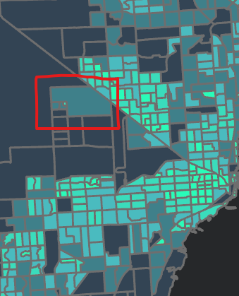
For example -
without the normalization there is an
area (Census Tract 90.40) that is the
brightest on all
my maps.
With normalization - this same area does have a
concentration of seniors but it does not have the
highest concentration.
 |
Senior Population of Miami-Dade County by Square Miles |


Comments
Post a Comment